Chart.js library is open-source to create interactive and beautiful charts for your angular application. These charts are not just static charts, these are data-driven charts.
Using the chart js angular application, you can create dynamic charts with data-driven visualization.
Click to see official documents for the chart js library, you can see here the number of options you have to create the different types of charts.
Let’s start our journey to create 8 types of charts using the chart js angular library.
- Line Chart with Multiple Datasets
- Pie Chart
- Bar Chart with Stacked Datasets
- Scatter Plot with Custom Tooltips
- Area Chart
- Bubble Chart
- Polar Area Chart
- Radar Chart
First, you need to install this chart js angular library with its dependency and its types, for that, you must run this command.
npm install chart.js@2.9.4
npm install @types/chart.js --save-dev
I found this version most comfortable to work with. You can also use the latest one by running these commands.
npm install chart.js --save
npm install @types/chart.js --save-dev
Once you installed the chart js angular dependencies then you need to import them inside your app component or your chart component where you want to show the charts, for this example, I am writing all my code to app.component.ts and app.component.html files.
You can create a new component for displaying these charts.
Here is the Github Link for learning more about the chart js library.
Let’s import the chart js inside the app.component.ts file.
import { Component, OnInit } from '@angular/core';
import { Chart } from 'chart.js';
Now let’s start exploring each chart type one by one. You can simply copy these codes and use them for your project.
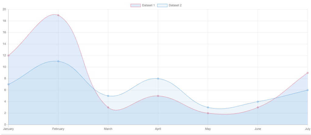
Line Chart with Multiple Datasets
In this example, we will create a line chart with multiple datasets, so before explaining let me tell you again that I am creating all the charts inside the app component, you can create a separate component to do these tasks.
First of all, this is our app.component.ts file, where we have created a variable of type `any` called lineChart.
lineChart will create a new Chart with an id line-chart which we defined in the first column of the new Chart object.
Inside this lineChart variable, we are setting the type property to 'line' and providing an array of labels ex. January, February, etc., and two datasets in the data property. Each dataset contains an array of data values and options, such as the backgroundColor, borderColor, borderWidth properties.
import { Component, OnInit } from '@angular/core';
import { Chart } from 'chart.js';
@Component({
  selector: 'app-root',
  templateUrl: './app.component.html',
  styleUrls: ['./app.component.css']
})
export class AppComponent {
lineChart:any;

ngOnInit(): void {
    this.lineChart = new Chart('line-chart', {
      type: 'line',
      data: {
        labels: ['January', 'February', 'March', 'April', 'May', 'June', 'July'],
        datasets: [
          {
            label: 'Dataset 1',
            data: [12, 19, 3, 5, 2, 3, 9],
            backgroundColor: 'rgba(54, 162, 235, 0.2)',
            borderColor: 'rgba(255, 99, 132, 1)',
            borderWidth: 1
          },
          {
            label: 'Dataset 2',
            data: [7, 11, 5, 8, 3, 4, 6],
            backgroundColor: 'rgba(34, 164, 225, 0.1)',
            borderColor: 'rgba(34, 164, 225, 1)',
            borderWidth: 1
          }
        ]
      },
      options: {
        scales: {
          yAxes: [{
            ticks: {
              beginAtZero: true
            }
          }]
        }
      }
    });
}
}
For the HTML part, we just need to add the HTML canvas to draw this line chart.
<div class="chart-container">
  <canvas id="line-chart" class="my-4" width="900" height="380"></canvas>
</div>
The id of the canvas should be the same as the id we added inside the chart object.
The output of line Chart
The basic details for adding an id in Canvas and defining the type of chart inside the new Chart object are mostly similar for all other types of charts.
For the rest of the charts, you can just copy the typescript code and HTML canvas code from above and change the id, and you will get the output.
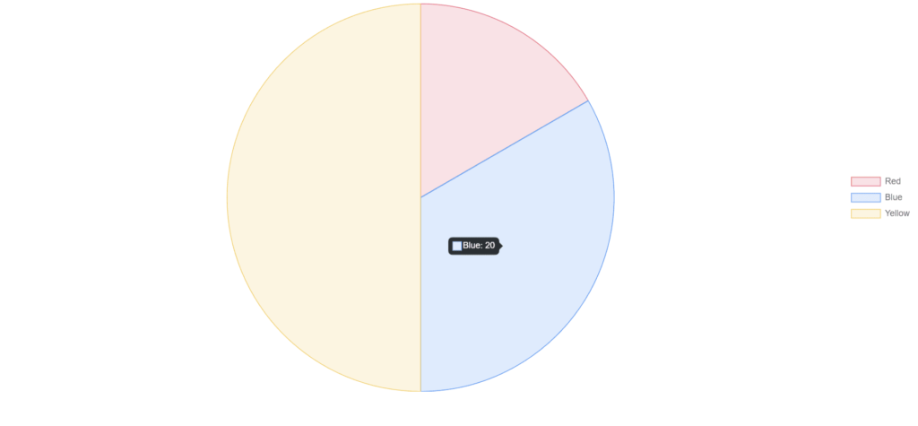
Pie Chart
import { Component, OnInit } from '@angular/core';
import { Chart } from 'chart.js';
@Component({
  selector: 'app-root',
  templateUrl: './app.component.html',
  styleUrls: ['./app.component.css']
})
export class AppComponent {
lineChart:any;

ngOnInit(): void {
    this.pieChart = new Chart('pie-chart', {
      type: 'pie',
      data: {
        labels: ['Red', 'Blue', 'Yellow'],
        datasets: [
          {
            data: [10, 20, 30],
            backgroundColor: [
              'rgba(255, 99, 132, 0.2)',
              'rgba(54, 162, 235, 0.2)',
              'rgba(255, 206, 86, 0.2)'
            ],
            borderColor: [
              'rgba(255, 99, 132, 1)',
              'rgba(54, 162, 235, 1)',
              'rgba(255, 206, 86, 1)'
            ],
            borderWidth: 1
          }
        ]
      },
      options: {
        responsive: true,
        legend: {
          position: 'right'
        }
      }
    });
}
}
The output of the Pie Chart
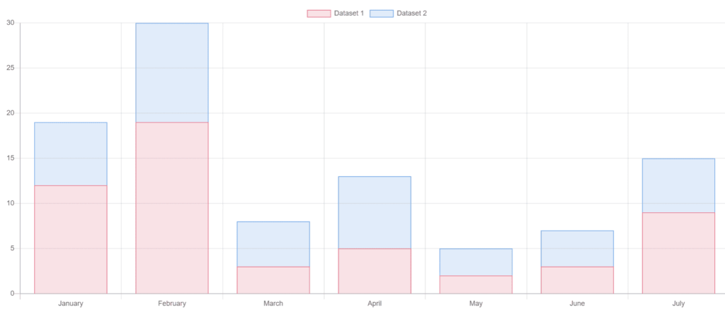
Bar Chart with Stacked Datasets
import { Component, OnInit } from '@angular/core';
import { Chart } from 'chart.js';
@Component({
  selector: 'app-root',
  templateUrl: './app.component.html',
  styleUrls: ['./app.component.css']
})
export class AppComponent {
lineChart:any;

ngOnInit(): void {
    this.barChart = new Chart('bar-chart', {
      type: 'bar',
      data: {
        labels: ['January', 'February', 'March', 'April', 'May', 'June', 'July'],
        datasets: [
          {
            label: 'Dataset 1',
            data: [12, 19, 3, 5, 2, 3, 9],
            backgroundColor: 'rgba(255, 99, 132, 0.2)',
            borderColor: 'rgba(255, 99, 132, 1)',
            borderWidth: 1
          },
          {
            label: 'Dataset 2',
            data: [7, 11, 5, 8, 3, 4, 6],
            backgroundColor: 'rgba(54, 162, 235, 0.2)',
            borderColor: 'rgba(54, 162, 235, 1)',
            borderWidth: 1
          }
        ]
      },
      options: {
        scales: {
          yAxes: [{
            stacked: true,
            ticks: {
              beginAtZero: true
            }
          }],
          xAxes: [{
            stacked: true
          }]
        }
      }
    });
}
}
The output of the Bar Chart
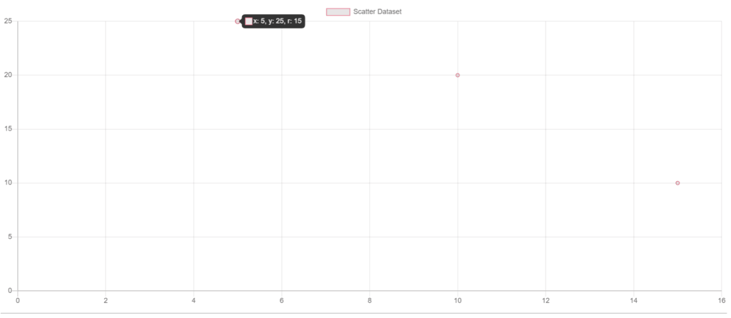
Scatter Plot with Custom Tooltips
import { Component, OnInit } from '@angular/core';
import { Chart } from 'chart.js';
@Component({
  selector: 'app-root',
  templateUrl: './app.component.html',
  styleUrls: ['./app.component.css']
})
export class AppComponent {
lineChart:any;

ngOnInit(): void {
    this.scatterChart = new Chart('scatter-chart', {
      type: 'scatter',
      data: {
        datasets: [{
          label: 'Scatter Dataset',
          data: [
            { x: 10, y: 20, r: 10 },
            { x: 15, y: 10, r: 5 },
            { x: 5, y: 25, r: 15 }
          ],
          backgroundColor: 'rgba(255, 99, 132, 0.2)',
          borderColor: 'rgba(255, 99, 132, 1)',
          borderWidth: 1
        }]
      },
      options: {
        tooltips: {
          callbacks: {
            label: (tooltipItem, data) => {
              const dataItem = data.datasets[tooltipItem.datasetIndex].data[tooltipItem.index];
              console.log(dataItem);
              return `x: ${dataItem.x}, y: ${dataItem.y}, r: ${dataItem.r}`;
            }
          }
        },
        scales: {
          xAxes: [{
            type: 'linear',
            position: 'bottom',
            ticks: {
              beginAtZero: true
            }
          }],
          yAxes: [{
            ticks: {
              beginAtZero: true
            }
          }]
        }
      }
    });
}
}
The output of the Bar Chart
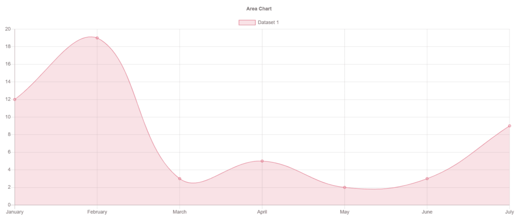
Area Chart
import { Component, OnInit } from '@angular/core';
import { Chart } from 'chart.js';
@Component({
  selector: 'app-root',
  templateUrl: './app.component.html',
  styleUrls: ['./app.component.css']
})
export class AppComponent {
lineChart:any;

ngOnInit(): void {
    this.areaChart = new Chart('area-chart', {
      type: 'line',
      data: {
        labels: ['January', 'February', 'March', 'April', 'May', 'June', 'July'],
        datasets: [{
          label: 'Dataset 1',
          data: [12, 19, 3, 5, 2, 3, 9],
          backgroundColor: 'rgba(255, 99, 132, 0.2)',
          borderColor: 'rgba(255, 99, 132, 1)',
          borderWidth: 1,
          fill: true
        }]
      },
      options: {
        title: {
          display: true,
          text: 'Area Chart'
        },
        scales: {
          yAxes: [{
            ticks: {
              beginAtZero: true
            }
          }]
        }
      }
    });
}
}
The output of the Area Chart
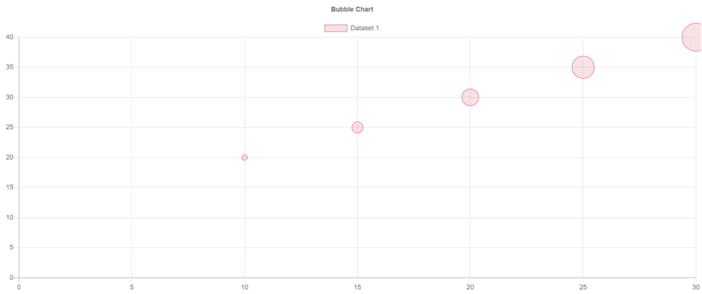
Bubble Chart
import { Component, OnInit } from '@angular/core';
import { Chart } from 'chart.js';
@Component({
  selector: 'app-root',
  templateUrl: './app.component.html',
  styleUrls: ['./app.component.css']
})
export class AppComponent {
lineChart:any;

ngOnInit(): void {
    this.bubbleChart = new Chart('bubble-chart', {
      type: 'bubble',
      data: {
        datasets: [{
          label: 'Dataset 1',
          data: [
            {x: 10, y: 20, r: 5},
            {x: 15, y: 25, r: 10},
            {x: 20, y: 30, r: 15},
            {x: 25, y: 35, r: 20},
            {x: 30, y: 40, r: 25},
          ],
          backgroundColor: 'rgba(255, 99, 132, 0.2)',
          borderColor: 'rgba(255, 99, 132, 1)',
          borderWidth: 1
        }]
      },
      options: {
        title: {
          display: true,
          text: 'Bubble Chart'
        },
        scales: {
          yAxes: [{
            ticks: {
              beginAtZero: true
            }
          }],
          xAxes: [{
            ticks: {
              beginAtZero: true
            }
          }]
        }
      }
    });
}
}
The output of the Bubble Chart
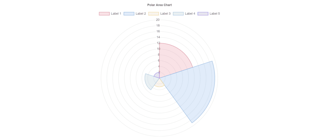
Polar Area Chart
import { Component, OnInit } from '@angular/core';
import { Chart } from 'chart.js';
@Component({
  selector: 'app-root',
  templateUrl: './app.component.html',
  styleUrls: ['./app.component.css']
})
export class AppComponent {
lineChart:any;

ngOnInit(): void {
    this.polarAreaChart = new Chart('polar-area-chart', {
      type: 'polarArea',
      data: {
        labels: ['Label 1', 'Label 2', 'Label 3', 'Label 4', 'Label 5'],
        datasets: [{
          label: 'Dataset 1',
          data: [12, 19, 3, 5, 2],
          backgroundColor: [
            'rgba(255, 99, 132, 0.2)',
            'rgba(54, 162, 235, 0.2)',
            'rgba(255, 206, 86, 0.2)',
            'rgba(75, 192, 192, 0.2)',
            'rgba(153, 102, 255, 0.2)'
          ],
          borderColor: [
            'rgba(255, 99, 132, 1)',
            'rgba(54, 162, 235, 1)',
            'rgba(255, 206, 86, 1)',
            'rgba(75, 192, 192, 1)',
            'rgba(153, 102, 255, 1)'
          ],
          borderWidth: 1
        }]
      },
      options: {
        title: {
          display: true,
          text: 'Polar Area Chart'
        },
        scale: {
          ticks: {
            beginAtZero: true
          }
        }
      }
    });
}
}
The output of the Polar Area Chart
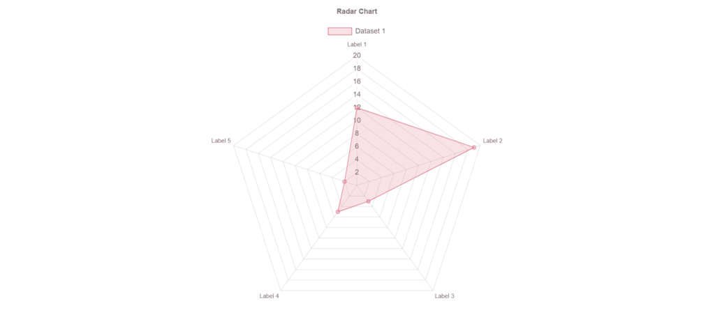
Radar Chart
import { Component, OnInit } from '@angular/core';
import { Chart } from 'chart.js';
@Component({
  selector: 'app-root',
  templateUrl: './app.component.html',
  styleUrls: ['./app.component.css']
})
export class AppComponent {
lineChart:any;

ngOnInit(): void {
    this.radarChart = new Chart('radar-chart', {
      type: 'radar',
      data: {
        labels: ['Label 1', 'Label 2', 'Label 3', 'Label 4', 'Label 5'],
        datasets: [{
          label: 'Dataset 1',
          data: [12, 19, 3, 5, 2],
          backgroundColor: 'rgba(255, 99, 132, 0.2)',
          borderColor: 'rgba(255, 99, 132, 1)',
          borderWidth: 1
        }]
      },
      options: {
        title: {
          display: true,
          text: 'Radar Chart'
        },
        scale: {
          ticks: {
            beginAtZero: true
          }
        }
      }
    });
}
}
The output of the Radar Chart
Now you know how to create a beautiful chart with angular and chart js. just take care of the HTML canvas and replace its id with the id you mention inside the new chart object, and the rest of the code is mentioned above. you won’t find much difficulty to understand these charts, it’s actually very simple and helpful.
If you are stuck on something and need some help please feel free to comment below.
Thank you for reading. 🙂
Some important article I would suggest to you are: