Enhancing UI interactions with engaging animations can elevate the user experience. In this guide, we’ll build an elegant overlapping card layout in React using TypeScript. These cards will smoothly reposition when clicked, creating a dynamic and interactive experience.
Features of the Overlapping Card Layout
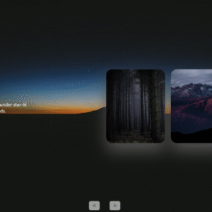
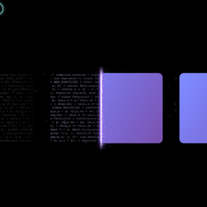
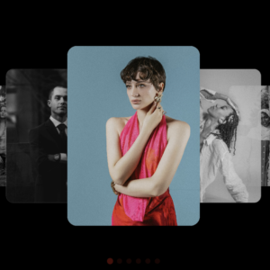
1. Horizontal Overlapping Layout
- Cards are arranged in a horizontal row with slight overlap.
- Each card has a subtle background image and gradient overlay.
- Z-index is utilized to ensure proper stacking order.
2. Interactive Features
- Clicking a card brings it to the foreground while pushing others aside.
- The active card scales up slightly and becomes fully opaque.
- Inactive cards fade slightly to create depth.
- Smooth transitions enhance the animation experience.
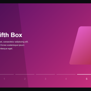
3. Visual Enhancements
- A gradient progress bar appears on the active card.
- Each card features a unique icon and color scheme.
- Subtle background images add visual depth.
- Shadows and smooth transitions contribute to a polished look.
4. Responsive Design
- Cards maintain proper positioning across different screen sizes.
- All animations remain fluid on various devices.
- Proper spacing and scaling ensure a visually appealing layout.
Implementation in React (TypeScript)
Create a new React project and install necessary dependencies:
npx create-react-app overlapping-cards --template typescript
cd overlapping-cards
npm install lucide-react
npm start
Now, modify src/App.tsx to implement the overlapping card layout:
import React, { useState } from 'react';
import { Code, Compass, Image, MessageCircle } from 'lucide-react';

const cards = [
  {
    title: "Development",
    description: "Build beautiful applications with modern tools",
    icon: <Code className="w-6 h-6 text-blue-400" />,
    color: "from-blue-500 to-cyan-400",
    bgImage: "https://images.unsplash.com/photo-1498050108023-c5249f4df085?auto=format&fit=crop&w=800&q=80"
  },
  {
    title: "Design",
    description: "Create stunning user interfaces that inspire",
    icon: <Image className="w-6 h-6 text-purple-400" />,
    color: "from-purple-500 to-pink-400",
    bgImage: "https://images.unsplash.com/photo-1558655146-9f40138edfeb?auto=format&fit=crop&w=800&q=80"
  },
  {
    title: "Navigation",
    description: "Guide users through seamless experiences",
    icon: <Compass className="w-6 h-6 text-green-400" />,
    color: "from-green-500 to-emerald-400",
    bgImage: "https://images.unsplash.com/photo-1544256718-3bcf237f3974?auto=format&fit=crop&w=800&q=80"
  },
  {
    title: "Community",
    description: "Connect and collaborate with others",
    icon: <MessageCircle className="w-6 h-6 text-orange-400" />,
    color: "from-orange-500 to-amber-400",
    bgImage: "https://images.unsplash.com/photo-1515187029135-18ee286d815b?auto=format&fit=crop&w=800&q=80"
  }
];

function App() {
  const [activeIndex, setActiveIndex] = useState<number | null>(null);

  return (
    <div className="min-h-screen bg-gray-900 flex items-center justify-center py-12 px-4">
      <div className="max-w-7xl mx-auto">
        <h1 className="text-4xl font-bold text-center text-white mb-16">
          Interactive Cards
        </h1>

        <div className="relative h-[400px] flex items-center justify-center">
          {cards.map((card, index) => (
            <div
              key={index}
              onClick={() => setActiveIndex(index)}
              className={`
                absolute
                w-[300px]
                bg-gray-800
                rounded-xl
                p-6
                cursor-pointer
                transition-all
                duration-500
                ease-out
                ${index === activeIndex ? 'z-30 scale-110' : `z-${20 - index}`}
                ${getCardPosition(index, cards.length, activeIndex)}
              `}
              style={{
                transform: `
                  translateX(${getTranslateX(index, cards.length, activeIndex)}px)
                  scale(${index === activeIndex ? 1.1 : 1})
                `,
                boxShadow: '0 4px 6px -1px rgba(0, 0, 0, 0.1), 0 2px 4px -1px rgba(0, 0, 0, 0.06)'
              }}
            >
              <div
                className="absolute inset-0 rounded-xl bg-cover bg-center opacity-10"
                style={{ backgroundImage: `url(${card.bgImage})` }}
              />

              <div className="relative">
                <div className={`h-12 w-12 rounded-lg flex items-center justify-center mb-4 bg-opacity-20 bg-gradient-to-r ${card.color}`}>
                  {card.icon}
                </div>

                <h3 className="text-xl font-semibold text-white mb-2">
                  {card.title}
                </h3>

                <p className="text-gray-400">
                  {card.description}
                </p>
              </div>
            </div>
          ))}
        </div>
      </div>
    </div>
  );
}

function getTranslateX(index: number, total: number, activeIndex: number | null): number {
  const baseOffset = -((total - 1) * 40);
  const cardOffset = index * 80;

  if (activeIndex === null) {
    return baseOffset + cardOffset;
  }

  if (index === activeIndex) {
    return 0;
  }

  if (index < activeIndex) {
    return -200 + (index * 40);
  }

  return 200 - ((total - 1 - index) * 40);
}

function getCardPosition(index: number, total: number, activeIndex: number | null): string {
  if (activeIndex === null) {
    return 'hover:scale-105';
  }

  if (index === activeIndex) {
    return 'shadow-2xl';
  }

  return 'opacity-50';
}

export default App;
Conclusion
This implementation creates an elegant and interactive card layout with smooth transitions and animations. Users can engage with the cards dynamically, bringing them to focus while maintaining a visually appealing design. The approach is fully responsive, ensuring a seamless experience across various screen sizes. Try enhancing this layout further by adding more animations, dynamic content, or integrating it into a larger UI component!