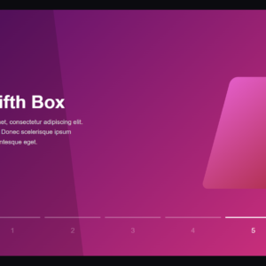
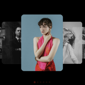
A sleek, modern image carousel designed to capture the beauty and emotion of travel through visuals and motion. Each slide stretches across the full screen, immersing you in breathtaking destinations — from the misty highlands of Scotland to the glowing nights of Japan. The smooth slide transitions create a sense of calm and continuity, while the soft overlay text gently introduces the story behind each scene.
The navigation is simple and intuitive — just use the ◁ and ▷ controls to move between locations at your own pace. Every destination feels like a postcard brought to life, accompanied by a short description and a “See More” button that invites deeper exploration.
This image slider isn’t just a design element; it’s a storytelling experience. It’s perfect for travel blogs, portfolio showcases, or any creative website that values both aesthetics and engagement. The balance of motion, minimalism, and atmosphere makes it visually appealing without ever feeling cluttered.
Full Code
<!DOCTYPE html>
<html lang="en">
<head>
    <meta charset="UTF-8">
    <meta name="viewport" content="width=device-width, initial-scale=1.0">
    <title>Animated Image Slider</title>
    <style>
        * {
  margin: 0;
  padding: 0;
  box-sizing: border-box;
}

body {
  background: #b9bbb9;
  overflow: hidden;
}

.container {
  position: absolute;
  top: 50%;
  left: 50%;
  transform: translate(-50%, -50%);
  width: 1300px;
  height: 750px;
  background: #f5f5f5;
  box-shadow: 0 30px 50px #dbdbdb;
  border-radius: 20px;
}
.container .slide {
  border-radius: 20px;
}
.container .slide .item {
  width: 200px;
  height: 250px;
  position: absolute;
  top: 50%;
  transform: translate(0, -50%);
  border-radius: 20px;
  box-shadow: 0 30px 50px #505050;
  background-position: 50% 50%;
  background-size: cover;
  display: inline-block;
  transition: all 0.5s;
}

.slide .item:nth-child(1),
.slide .item:nth-child(2) {
  top: 0;
  left: 0;
  transform: translate(0, 0);
  border-radius: 0;
  width: 100%;
  height: 100%;
  border-radius: 20px;
  transition: all .5s;
}

.slide .item:nth-child(3) {
  left: 50%;
}
.slide .item:nth-child(4) {
  left: calc(50% + 220px);
}
.slide .item:nth-child(5) {
  left: calc(50% + 440px);
}

.slide .item:nth-child(n + 6) {
  left: calc(50% + 660px);
  opacity: 0;
}
.item .content {
  position: absolute;
  top: 50%;
  left: 100px;
  width: 300px;
  text-align: left;
  color: #eee;
  transform: translate(0, -50%);
  font-family: system-ui;
  display: none;
}

.slide .item:nth-child(2) .content {
  display: block;
}

.content .name {
  font-size: 40px;
  text-transform: uppercase;
  font-weight: bold;
  opacity: 0;
  animation: animate 1s ease-in-out 1 forwards;
}

.content .des {
  margin-top: 10px;
  margin-bottom: 20px;
  opacity: 0;
  animation: animate 1s ease-in-out 0.3s 1 forwards;
}

.content button {
  padding: 10px 20px;
  border: none;
  cursor: pointer;
  opacity: 0;
  border-radius: 10px;
  background-color: rgba(255, 255, 255, 0.673);
  transition: all 0.5s;
  animation: animate 1s ease-in-out 0.6s 1 forwards;
}

.content button:hover {
  background-color: rgb(255, 255, 255);
}

@keyframes animate {
  from {
    opacity: 0;
    transform: translate(0, 100px);
    filter: blur(33px);
  }

  to {
    opacity: 1;
    transform: translate(0);
    filter: blur(0);
  }
}

.button {
  display: flex;
  flex-direction: row;
  gap: 20px;
  left: 45%;
  right: 50%;
  width: 100%;
  align-items: center;
  text-align: center;
  position: absolute;
  bottom: 20px;
}

.button button {
  width: 40px;
  height: 35px;
  border-radius: 8px;
  border: none;
  cursor: pointer;
  margin: 0 5px;
  border: 2px solid #000000bd;
  transition: 0.3s;
  background: rgba(255, 255, 255, 0.578);
}

.button button:hover {
  color: #000000;
  border: 2px solid #ffffffbd;
  transform: scale(1.1);
}
.button button:focus {
  transform: scale(1.1);
  background: #ffffff;
  border: 2px solid #ffffffbd;
}
.button button:active {
  transform: scale(1.02);
}
.next {
  padding: 0 0 0 3px;
}
.prev {
  padding: 0 3px 0 0;
}

.MDJAminDiv {
  z-index: 4444;
  position: fixed;
  bottom: 5%;
  left: 2%;
}

.MDJAmin {
  text-decoration: none;
  border-bottom: 1px dashed rgb(44, 44, 44);
  border-top: 1px dashed rgb(44, 44, 44);
  padding: 4px 0;
  color: rgba(44, 44, 44, 0.525);

  font-family: monospace;
  font-style: italic;
  font-size: 1.1em;
  transition: all 0.5s;
}

.MDJAmin:hover {
  color: #000000;
}

    </style>
</head>
  <body>
    <div class="container">
      <div class="slide">
        <div
          class="item"
          style="
            background-image: url('https://images.unsplash.com/photo-1478760329108-5c3ed9d495a0?q=80&w=1074&auto=format&fit=crop&ixlib=rb-4.1.0&ixid=M3wxMjA3fDB8MHxwaG90by1wYWdlfHx8fGVufDB8fHx8fA%3D%3D');
          "
        >
          <div class="content">
            <div class="name">Scotland</div>
            <div class="des">
              Experience the mystical Highlands under twilight skies and misty lochs.
            </div>
            <a
              class="seeMore"
              target="_blank"
              href="https://github.com/MDJAmin"
              ><button>See More</button></a
            >
          </div>
        </div>

        <div
          class="item"
          style="
            background-image: url('https://images.unsplash.com/photo-1439792675105-701e6a4ab6f0?q=80&w=1173&auto=format&fit=crop&ixlib=rb-4.1.0&ixid=M3wxMjA3fDB8MHxwaG90by1wYWdlfHx8fGVufDB8fHx8fA%3D%3D');
          "
        >
          <div class="content">
            <div class="name">Norway</div>
            <div class="des">
              Chase the Northern Lights under star-lit skies along scenic fjord roads.
            </div>
            <a
              class="seeMore"
              target="_blank"
              href="https://github.com/MDJAmin"
              ><button>See More</button></a
            >
          </div>
        </div>

        <div
          class="item"
          style="
            background-image: url('https://images.unsplash.com/photo-1483982258113-b72862e6cff6?q=80&w=1170&auto=format&fit=crop&ixlib=rb-4.1.0&ixid=M3wxMjA3fDB8MHxwaG90by1wYWdlfHx8fGVufDB8fHx8fA%3D%3D');
          "
        >
          <div class="content">
            <div class="name">New Zealand</div>
            <div class="des">
              Wander dramatic, mist-laden mountain paths that feel straight out of a dream.
            </div>
            <a
              class="seeMore"
              target="_blank"
              href="https://github.com/MDJAmin"
              ><button>See More</button></a
            >
          </div>
        </div>

        <div
          class="item"
          style="
            background-image: url('https://images.unsplash.com/photo-1477346611705-65d1883cee1e?q=80&w=2070&auto=format&fit=crop&ixlib=rb-4.1.0&ixid=M3wxMjA3fDB8MHxwaG90by1wYWdlfHx8fGVufDB8fHx8fA%3D%3D');
          "
        >
          <div class="content">
            <div class="name">Japan</div>
            <div class="des">
              Discover serene mountain temples shrouded in dusk and ancient forest trails.
            </div>
            <a
              class="seeMore"
              target="_blank"
              href="https://github.com/MDJAmin"
              ><button>See More</button></a
            >
          </div>
        </div>
      </div>
      <div class="button">
        <button class="prev">◁</button>
        <button class="next">▷</button>
      </div>
    </div>
    <script>
        "use strict";

let next = document.querySelector(".next");
let prev = document.querySelector(".prev");

next.addEventListener("click", function () {
  let items = document.querySelectorAll(".item");
  document.querySelector(".slide").appendChild(items[0]);
});

prev.addEventListener("click", function () {
  let items = document.querySelectorAll(".item");
  document.querySelector(".slide").prepend(items[items.length - 1]);
});

    </script>
  </body>

</html>
Credit: https://codepen.io/MDJAmin/pen/GgpdKPy