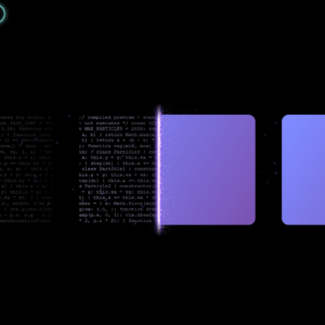
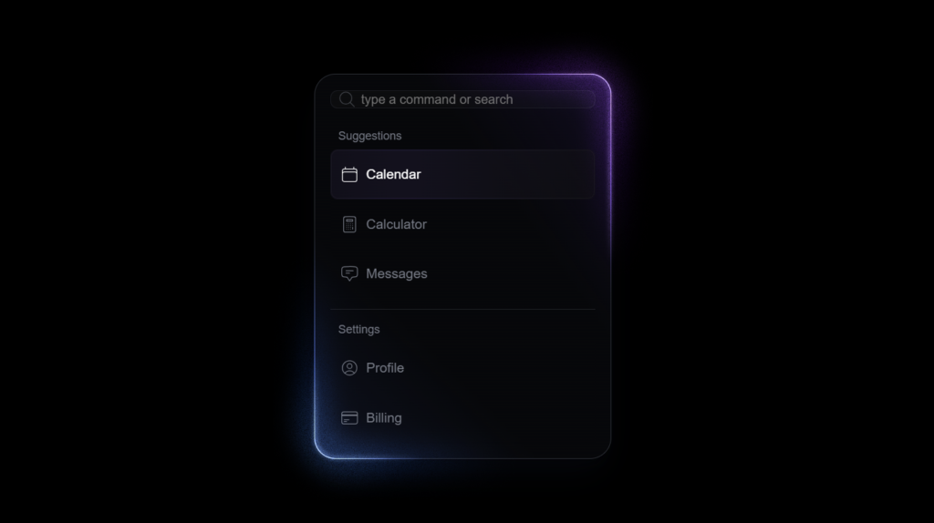
I recently built a sidebar menu that looks like it’s glowing — kind of like something you’d see in a futuristic dashboard. What makes it special is that it’s made entirely with plain HTML and CSS. No icons. No JavaScript. Just clean markup and some clever use of gradients, blur effects, and CSS variables. The menu slides in softly, has a blurred glass-like background, and the items glow when you hover or select them. I wanted it to feel smooth, interactive, and modern — and I’m pretty happy with how it turned out. Below is the code I used for both the HTML and CSS. Feel free to copy it, tweak it, or use it as inspiration for your own UI components.
HTML Code:
<!DOCTYPE html>
<html lang="en">
<head>
   <meta charset="UTF-8">
   <meta name="viewport" content="width=device-width, initial-scale=1.0">
   <link rel="stylesheet" href="style.css">
   <title>Document</title>
</head>
<body>
   <aside id="menu" class="open dark">
    <span class="shine shine-top"></span>
    <span class="shine shine-bottom"></span>
    <span class="glow glow-top"></span>
    <span class="glow glow-bottom"></span>
    <span class="glow glow-bright glow-top "></span>
    <span class="glow glow-bright glow-bottom "></span>

    <div class="inner">

        <label>
            <svg xmlns="http://www.w3.org/2000/svg" fill="none" viewBox="0 0 24 24" stroke-width="1.5" stroke="currentColor" class="size-6">
                <path stroke-linecap="round" stroke-linejoin="round" d="m21 21-5.197-5.197m0 0A7.5 7.5 0 1 0 5.196 5.196a7.5 7.5 0 0 0 10.607 10.607Z" />
            </svg>
            <input type="text" placeholder="type a command or search" />
        </label>

        <section>
            <header>Suggestions</header>
            <ul>
                <li class="selected">
                    <svg xmlns="http://www.w3.org/2000/svg" fill="none" viewBox="0 0 24 24" stroke-width="1" stroke="currentColor">
                      <path stroke-linecap="round" stroke-linejoin="round" d="M6.75 3v2.25M17.25 3v2.25M3 18.75V7.5a2.25 2.25 0 0 1 2.25-2.25h13.5A2.25 2.25 0 0 1 21 7.5v11.25m-18 0A2.25 2.25 0 0 0 5.25 21h13.5A2.25 2.25 0 0 0 21 18.75m-18 0v-7.5A2.25 2.25 0 0 1 5.25 9h13.5A2.25 2.25 0 0 1 21 11.25v7.5" />
                    </svg>
                    Calendar
                </li>
                <li>
                    <svg xmlns="http://www.w3.org/2000/svg" fill="none" viewBox="0 0 24 24" stroke-width="1.5" stroke="currentColor" class="size-6">
                      <path stroke-linecap="round" stroke-linejoin="round" d="M15.75 15.75V18m-7.5-6.75h.008v.008H8.25v-.008Zm0 2.25h.008v.008H8.25V13.5Zm0 2.25h.008v.008H8.25v-.008Zm0 2.25h.008v.008H8.25V18Zm2.498-6.75h.007v.008h-.007v-.008Zm0 2.25h.007v.008h-.007V13.5Zm0 2.25h.007v.008h-.007v-.008Zm0 2.25h.007v.008h-.007V18Zm2.504-6.75h.008v.008h-.008v-.008Zm0 2.25h.008v.008h-.008V13.5Zm0 2.25h.008v.008h-.008v-.008Zm0 2.25h.008v.008h-.008V18Zm2.498-6.75h.008v.008h-.008v-.008Zm0 2.25h.008v.008h-.008V13.5ZM8.25 6h7.5v2.25h-7.5V6ZM12 2.25c-1.892 0-3.758.11-5.593.322C5.307 2.7 4.5 3.65 4.5 4.757V19.5a2.25 2.25 0 0 0 2.25 2.25h10.5a2.25 2.25 0 0 0 2.25-2.25V4.757c0-1.108-.806-2.057-1.907-2.185A48.507 48.507 0 0 0 12 2.25Z" />
                    </svg>
                    Calculator
                </li>
                <li>
                    <svg xmlns="http://www.w3.org/2000/svg" fill="none" viewBox="0 0 24 24" stroke-width="1.5" stroke="currentColor" class="size-6">
                      <path stroke-linecap="round" stroke-linejoin="round" d="M7.5 8.25h9m-9 3H12m-9.75 1.51c0 1.6 1.123 2.994 2.707 3.227 1.129.166 2.27.293 3.423.379.35.026.67.21.865.501L12 21l2.755-4.133a1.14 1.14 0 0 1 .865-.501 48.172 48.172 0 0 0 3.423-.379c1.584-.233 2.707-1.626 2.707-3.228V6.741c0-1.602-1.123-2.995-2.707-3.228A48.394 48.394 0 0 0 12 3c-2.392 0-4.744.175-7.043.513C3.373 3.746 2.25 5.14 2.25 6.741v6.018Z" />
                    </svg>
                    Messages
                </li>
            </ul>
        </section>

        <hr>

        <section>
            <header>Settings</header>
            <ul>
                <li>
                    <svg xmlns="http://www.w3.org/2000/svg" fill="none" viewBox="0 0 24 24" stroke-width="1.5" stroke="currentColor" class="size-6">
                      <path stroke-linecap="round" stroke-linejoin="round" d="M17.982 18.725A7.488 7.488 0 0 0 12 15.75a7.488 7.488 0 0 0-5.982 2.975m11.963 0a9 9 0 1 0-11.963 0m11.963 0A8.966 8.966 0 0 1 12 21a8.966 8.966 0 0 1-5.982-2.275M15 9.75a3 3 0 1 1-6 0 3 3 0 0 1 6 0Z" />
                    </svg>
                    Profile
                </li>
                <li>
                    <svg xmlns="http://www.w3.org/2000/svg" fill="none" viewBox="0 0 24 24" stroke-width="1.5" stroke="currentColor" class="size-6">
                      <path stroke-linecap="round" stroke-linejoin="round" d="M2.25 8.25h19.5M2.25 9h19.5m-16.5 5.25h6m-6 2.25h3m-3.75 3h15a2.25 2.25 0 0 0 2.25-2.25V6.75A2.25 2.25 0 0 0 19.5 4.5h-15a2.25 2.25 0 0 0-2.25 2.25v10.5A2.25 2.25 0 0 0 4.5 19.5Z" />
                    </svg>
                    Billing
                </li>
            </ul>
        </section>

    </div>

</aside>
</body>
</html>
CSS Code:
:root {
    /* vars */

    --hue1: 255;
    --hue2: 222;
    --border: 1px;
    --border-color: hsl(var(--hue2), 12%, 20%);
    --radius: 22px;

    --ease: cubic-bezier(0.5, 1, 0.89, 1);

}

#menu {


    pointer-events: none;
    transition-property: visibility, opacity, filter;
    transition-duration: 0s, 0.25s, 0.25s;
    transition-delay: 0.5s, 0s, 0s;
    transition-timing-function: var(--ease);
    filter: blur(4px);

    font-family: 'Asap', sans-serif;
    color: #737985;

    position: fixed;
    top: 140px;
    left: 37vw;
    min-width: 275px;
    min-height: 275px;
    border-radius: var(--radius);
    border: var(--border) solid var(--border-color);
    padding: 1em;
    background: linear-gradient(235deg, hsl(var(--hue1) 50% 10% / 0.8), hsl(var(--hue1) 50% 10% / 0) 33%), linear-gradient(45deg , hsl(var(--hue2) 50% 10% / 0.8), hsl(var(--hue2) 50% 10% / 0) 33%), linear-gradient(hsl(220deg 25% 4.8% / 0.66));
    backdrop-filter: blur(12px);
    box-shadow: hsl(var(--hue2) 50% 2%) 0px 10px 16px -8px, hsl(var(--hue2) 50% 4%) 0px 20px 36px -14px;
}


#menu.open {

    visibility: visible;
    opacity: 1;
    pointer-events: auto;
    transition-delay: 0s;
    filter: blur(0px);

    &::before,
    &::after,
    & .glow,
    & .shine {
        animation: glow 1s var(--ease) both;
    }
    & .shine {
        animation-delay: 0s;
        animation-duration: 2s;
    }
    & .glow {
        animation-delay: 0.2s;
    }
    & .glow-bright {
        animation-delay: 0.1s;
        animation-duration: 1.5s;
    }
    & .shine-bottom {
        animation-delay: 0.1s;
        animation-duration: 1.8s;
    }
    & .glow-bottom {
        animation-delay: 0.3s;
    }
    & .glow-bright.glow-bottom {
        animation-delay: 0.3s;
        animation-duration: 1.1s;
    }
}

#menu .shine,
#menu .glow {
    --hue: var(--hue1);
}
#menu .shine-bottom,
#menu .glow-bottom {
    --hue: var(--hue2);
    --conic: 135deg;
}

#menu .shine {
}

#menu .shine,
#menu .shine::before,
#menu .shine::after {

    pointer-events: none;

    border-radius: 0;
    border-top-right-radius: inherit;
    border-bottom-left-radius: inherit;
    border: 1px solid transparent;

    width: 75%;
    height: auto;
    min-height: 0px;
    aspect-ratio: 1;
    display: block;
    position: absolute;
    right: calc(var(--border) * -1);
    top: calc(var(--border) * -1);
    left: auto;

    z-index: 1;

    --start: 12%;
    background: conic-gradient(
        from var(--conic, -45deg) at center in oklch,
        transparent var(--start,0%), hsl( var(--hue), var(--sat,80%), var(--lit,60%)), transparent  var(--end,50%)
    ) border-box;

    mask:
        linear-gradient(transparent),
        linear-gradient(black);
    mask-repeat: no-repeat;
    mask-clip: padding-box, border-box;
    mask-composite: subtract;

}

#menu .shine::before,
#menu .shine::after {
    content: "";
    width: auto;
    inset: -2px;
    mask: none;
}

#menu .shine::after {
    z-index: 2;
    --start: 17%;
    --end: 33%;
    background: conic-gradient(
        from var(--conic, -45deg) at center in oklch,
        transparent var(--start,0%), hsl( var(--hue), var(--sat,80%), var(--lit,85%)), transparent var(--end,50%)
    );

}

#menu .shine-bottom {
    top: auto;
    bottom: calc(var(--border) * -1);
    left: calc(var(--border) * -1);
    right: auto;
}

#menu .glow {

    pointer-events: none;

    border-top-right-radius: calc(var(--radius) * 2.5);
    border-bottom-left-radius: calc(var(--radius) * 2.5);
    border: calc(var(--radius) * 1.25) solid transparent;
    inset: calc(var(--radius) * -2);

    width: 75%;
    height: auto;
    min-height: 0px;
    aspect-ratio: 1;
    display: block;
    position: absolute;
    left: auto;
    bottom: auto;

    mask: url('https://assets.codepen.io/13471/noise-base.png');
    mask-mode: luminance;
    mask-size: 29%;

    opacity: 1;
    filter: blur(12px) saturate(1.25) brightness(0.5);
    mix-blend-mode: plus-lighter;
    z-index: 3;

    &.glow-bottom {
        inset: calc(var(--radius) * -2);
        top: auto;
        right: auto;
    }

    &::before,
    &::after {
        content: "";
        position: absolute;
        inset: 0;
        border: inherit;
        border-radius: inherit;
        background: conic-gradient(
            from var(--conic, -45deg) at center in oklch,
            transparent var(--start,0%), hsl( var(--hue), var(--sat,95%), var(--lit,60%)), transparent  var(--end,50%)
        ) border-box;
        mask:
            linear-gradient(transparent),
            linear-gradient(black);
        mask-repeat: no-repeat;
        mask-clip: padding-box, border-box;
        mask-composite: subtract;
        filter: saturate(2) brightness(1);

    }

    &::after {
        --lit: 70%;
        --sat: 100%;
        --start: 15%;
        --end: 35%;
        border-width: calc(var(--radius) * 1.75);
        border-radius: calc(var(--radius) * 2.75);
        inset: calc(var(--radius) * -0.25);
        z-index: 4;
        opacity: 0.75;
    }
    &.glow-bottom::after {
    }

}

#menu .glow-bright {

    --lit: 80%;
    --sat: 100%;
    --start: 13%;
    --end: 37%;

    border-width: 5px;
    border-radius: calc(var(--radius) + 2px);
    inset: -7px;
    left: auto;
    filter: blur(2px) brightness(0.66);

    &::after {
        content: none;
    }

    &.glow-bottom {
        inset: -7px;
        right: auto;
        top: auto;
    }
}

#menu .inner,
#menu section {
    display: flex;
    flex-direction: column;
    gap: 0.5em;
}

#menu .inner {
    font-size: 0.875rem;
}

#menu hr {
    width: 100%;
    height: 0.5px;
    background: var(--border-color);
    border: none;
    margin: 0.25em 0 0.5em;
    opacity: 0.66;
}

#menu input {
    --tint2: hsl(var(--hue2) 50% 90% / 0.1);
    font-family: 'Asap', sans-serif;
    font-weight: 300;
    box-shadow: 0 0 0 1px transparent;
    border: 1px solid hsl(var(--hue2) 13% 18.5% / 0.5);
    background: hsl(var(--hue1) 0% 40% / 0.05);
    border-radius: calc(var(--radius) * 0.33333);
    padding-left: 2.33em;

}

#menu label {
    display: grid;
    grid-template: 1fr/1fr;
    margin-bottom: 1em;
    width: 100%;
    & > * {
        grid-area: 1/1;
        align-self: center;
    }

    & svg {
        margin-left: 0.5em;
        opacity: 0.5;
    }
}

#menu header {
    font-size: 0.75rem;
    font-weight: 300;
    padding: 0 0.66em;
}

#menu ul {
    list-style: none;
    padding: 0;
    margin: 0;
}

#menu li {
    position: relative;
    padding: 0.66em;
    height: 32px;
    display: flex;
    align-items: center;
    gap: 0.5em;
    border-radius: calc(var(--radius) * 0.33333);
    border: 1px solid transparent;
    transition: all 0.3s ease-in, --item-opacity 0.3s ease-in;
    background:
        linear-gradient(
            90deg  in oklch,
            hsl(var(--hue1) 29% 13% / var(--item-opacity)),
            hsl(var(--hue1) 30% 15% / var(--item-opacity)) 24% 32%,
            hsl(var(--hue1) 5% 7% / var(--item-opacity))
        ) border-box;

    &::after {
        content: "";
        position: absolute;
        inset: 0;
        border-radius: inherit;
        border: inherit;
        background:
            linear-gradient(
                90deg  in oklch,
                hsl(var(--hue1) 15% 16% / var(--item-opacity)),
                hsl(var(--hue1) 40% 24% / var(--item-opacity)) 20% 32%,
                hsl(var(--hue1) 2% 12% / var(--item-opacity))
            ) border-box;
        mask:
            linear-gradient(transparent),
            linear-gradient(black);
        mask-repeat: no-repeat;
        mask-clip: padding-box, border-box;
        mask-composite: subtract;
    }

    &:hover,
    &.selected,
    &:hover::after,
    &.selected::after {
        --item-opacity: 0.5;
        transition: all 0.1s ease-out, --item-opacity 0.1s ease-out;
        color: white;
    }

    &.selected,
    &.selected::after {
        animation: flash 0.75s ease-out 1 forwards;
    }
}

@property --item-opacity {
    syntax: "<number>";
    inherits: false;
    initial-value: 0;
}


body {
    background: #000;
    /* background-image: url(https://assets.codepen.io/13471/abstract-light.jpg), linear-gradient(to right in oklab, hsl(var(--hue2) 50% 75%), hsl(var(--hue1) 50% 75%)); */
    background-size: cover;
    background-position: center;
    background-blend-mode: hard-light;
    padding: 0;
}

body, #app {
    height: 100vh;
}


#menu svg {
    fill: none;
    stroke-width: 1;
    height: 20px;
}
Conclusion:
Thanks for checking this out! I hope this little project gave you some ideas on what’s possible with just HTML and CSS. If you’re into UI experiments like this, there’s a lot more you can try — from neon buttons to animated loaders.
Feel free to explore more creative web experiments here:
Creating Overlapping Cards with Click Animation in React
How to Design Comic Book Speech Bubbles