In this blog post, we’ll dive into creating a stylish notebook design using just HTML and CSS! Imagine transforming your web page into a beautiful, interactive notebook that captivates your audience. I’ll guide you through each step, from crafting the layout to adding delightful details that bring your notebook to life. Whether you’re a beginner or looking to enhance your design skills, this tutorial is perfect for anyone wanting to explore creative web design. Let’s get started on this fun project together!
<article>
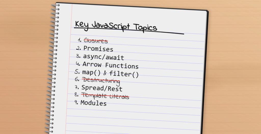
<h2>Key JavaScript Topics</h2>
<ol>
<li><del>Closures</del></li>
<li><code>Promises</code></li>
<li><code>async/await</code></li>
<li><code>Arrow Functions</code></li>
<li><code>map()</code> & <code>filter()</code></li>
<li><del>Destructuring</del></li>
<li><code>Spread/Rest</code></li>
<li><del>Template Literals</del></li>
<li><code>Modules</code></li>
</ol>
</article>
<style>
@import url('https://fonts.googleapis.com/css2?family=Indie+Flower&display=swap');
body {
background: #c96;
overflow: clip;
min-height: 100vh;
margin: 0;
display: flex;
justify-content: center;
background:
/* fake texture */
radial-gradient(70% 1% at 30% 5%, #c632 80%, #0000 0) 50% 50% / 100% 10%,
radial-gradient(60% 1.3% at 30% 5%, #c631 80%, #0000 0) 30% 50% / 70% 7.5%,
radial-gradient(50% 0.7% at 30% 5%, #c631 80%, #0000 0) 30% 50% / 50% 17.5%,
radial-gradient(60% 1% at 30% 5%, #c631 80%, #0000 0) 0% 10% / 60% 9%,
radial-gradient(80% 1.3% at 30% 5%, #a411 80%, #0000 0) 70% 20% / 66% 7.5%,
radial-gradient(100% 1.1% at 30% 5%, #c631 80%, #0000 0) 0% 17% / 70% 12.5%,
radial-gradient(60% 3% at 50% 0, #c631 80%, #0000 0) 0% 10% / 70% 7.5% repeat-y,
radial-gradient(40% 4% at 70% 5%, #b521 80%, #0000 0) 100% 2% / 70% 5%,
/* wood stains */
radial-gradient(80% 50% at 20% 20%, #c0824334 10%, #0000 25%),
radial-gradient(140% 50% at 90% 45%, #c0824324 10%, #0000 15%),
radial-gradient(100% 50% at 70% 50%, #c0824324 10%, #0000 15%),
/* base */
linear-gradient(to top right, #0001, #ffc5),
#f0a274;
}
article {
font-family: 'Indie Flower', 'Patrick Hand SC', 'Comic Neue', 'Comic Sans', 'Comic Sans MS', Helvetica, Arial, sans-serif;
font-size: 5vmin;
background: white;
padding: 2em 2em 2em 3em;
width: 85vmin;
height: 110vmin;
background:
/* radial-gradient(circle at 1em 50%, #000 0.3em, #0000 0.31em) 0 0 / 100% 33.3% repeat-y, */
radial-gradient(circle at 0.4em 50%, #000 0.125em, #0000 0.135em) 0 0 / 100% 3vmin repeat-y,
linear-gradient(90deg, #0000 2.35em, #fbb 0 2.4em, #0000 0),
repeating-linear-gradient(#0000 0 5%, #99f 0 5.1%) 100% 50% / calc(100% - 2.35em) 82% no-repeat,
#eee;
border-radius: 0.05em;
box-shadow:
0.1em 0.1em #ddd,
0.065em 0.05em #fff,
0.15em 0.15em #bbb,
0.125em 0 0 0.15em #333,
0.25em 0.125em 0 0.15em #000;
transform: rotate(3deg) translate(5%, 5%);
transform-origin: 10% 10%;
position: relative;
filter: drop-shadow(-0.25vmin 0.1em 0.35vmin #0002) drop-shadow(1vmin 0 1vmin #0003);
&::before {
content: "";
position: absolute;
top: 0;
left: -1em;
width: 1.5em;
height: 100%;
background:
linear-gradient(#0000 0.225em, #999 0 0.375em, #0000 0) 80% 0 / 68% 3vmin repeat-y,
linear-gradient(25deg, #0000 0.225em, #666 0 0.35em, #0000 0) 44% 0.1% / 40% 3vmin repeat-y,
radial-gradient(circle at 0.4em 50%, #999 0.075em, #0000 0.085em) 0 0 / 100% 3vmin repeat-y,
radial-gradient(circle at 1.4em 50%, #999 0.075em, #0000 0.085em) 0 0 / 100% 3vmin repeat-y,
#f000;
}
&::after {
content: "";
position: absolute;
top: 0;
left: -1em;
width: 1.5em;
height: 100%;
background:
linear-gradient(#0000 0.225em, #fff7 0 0.375em, #0000 0) 80% 0 / 68% 3vmin repeat-y;
mask:
linear-gradient(90deg, #0000 0.4em, #000 0.6em, #0000 1.2em),
linear-gradient(#0000 0.225em, #fff7 0.28em 0.3em, #0000 0.375em) 80% 0 / 68% 3vmin repeat-y;
mask-composite: intersect;
}
}
h2 {
margin: 0;
font-size: 6.5vmin;
white-space: pre;
position: relative;
&::before {
content: "";
position: absolute;
width: 95%;
height: 100%;
background: #f003;
background: radial-gradient(175% 100% at 50% 100%, #0000 50%, #000 51% 55%, #0000 56%);
left: -1%;
top: 25%;
transform: rotate(0.25deg)
}
}
del {
text-decoration-color: #f00c;
}
u {
text-decoration: none;
transform: rotate(-2deg) skew(-2deg);
position: relative;
display: inline-block;
&::before,
&::after {
content: "";
position: absolute;
width: 95%;
height: 100%;
background: #f003;
background: radial-gradient(195% 100% at 50% 100%, #0000 50%, #000 51% 55%, #0000 56%);
left: -1%;
top: 30%;
transform: rotate(0.25deg)
}
&::before {
transform: rotate(1.5deg);
left: 2%;
top: 40%;
}
}
ol {
line-height: 5.4vmin;
margin-top: 4.25vmin;
}
#comicss-link {
position: absolute;
color: #fff;
background: #080;
font-size: 16px;
font-family: Roboto, Helvetica, Arial, sans-serif;
text-decoration: none;
aspect-ratio: 1;
display: flex;
align-items: flex-end;
padding: 0 100px 5px 100px;
text-align: center;
transform: translate(-150px, -50px) rotate(-45deg);
top: 0;
left: 0;
white-space: pre;
z-index: 1;
}
</style>Credit: https://codepen.io/alvaromontoro/pen/mdggGbg