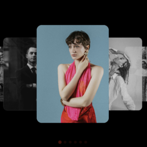
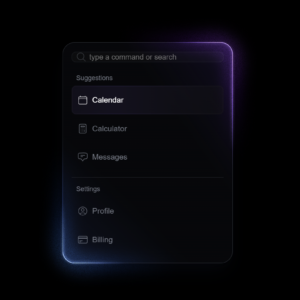
Modern web design is all about clean, soft, and elegant visuals. One of the most popular design trends today is Glassmorphism — a style that looks like frosted glass with blur, transparency, and glowing edges.
In this article, we’ll learn how we can build a beautiful Apple-style glass UI using only HTML and CSS.
1. The Main Container
Everything starts with a container that holds our glass elements.
We use a simple structure like this:
<div class="container">
  <div class="glass-container">
    <div class="glass-filter"></div>
    <div class="glass-overlay"></div>
    <div class="glass-specular"></div>
    <div class="glass-content">
      <!-- Your content goes here -->
    </div>
  </div>
</div>
Here’s what each part does:
.container→ wraps everything neatly and centers it..glass-container→ creates the main glass card or block..glass-filter,.glass-overlay, and.glass-specular→ these three layers together make the glass look shiny and transparent..glass-content→ holds your text, icons, or images.
2. The Glass Effect (The Most Important Part)
The real magic happens in CSS.
The key to glassmorphism is using blur and transparency together.
Here’s a small example of the core glass effect:
.glass-container {
  position: relative;
  background: rgba(255, 255, 255, 0.1); /* Transparent white */
  border-radius: 20px;
  backdrop-filter: blur(20px); /* This creates the blur effect */
  box-shadow: 0 8px 32px rgba(0, 0, 0, 0.2); /* Soft shadow */
  border: 1px solid rgba(255, 255, 255, 0.2); /* Light border */
}
Let’s break it down:
background: rgba(255, 255, 255, 0.1)makes the background see-through.backdrop-filter: blur(20px)adds the frosted glass blur.box-shadowgives a smooth, floating shadow.border-radiusmakes edges rounded, giving a soft and modern feel.
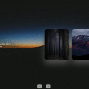
3. Adding a Cool Player Section
We also added a music player design that looks like something you’d see on an Apple device.
<div class="player">
  <div class="player__thumb">
    <img class="player__img" src="https://images.unsplash.com/photo-1619983081593-e2ba5b543168?w=400" alt="">
    <div class="player__legend">
      <h3 class="player__legend__title">All Of Me</h3>
      <span class="player__legend__sub-title">Nao</span>
    </div>
  </div>
</div>
This part shows an image (like an album cover), the title of the song, and the artist name.
We can also add control buttons using SVG icons:
<div class="player__controls">
  <svg viewBox="0 0 448 512" width="24">
    <path fill="black" d="M424.4 214.7L72.4 6.6C43.8-10.3..."></path>
  </svg>
</div>
SVG icons are perfect here because they stay sharp and lightweight.
4. The Navigation Section
We also created a mini navigation bar using icons and text.
Each menu item has a soft hover effect to feel interactive.
<div class="glass-item">
  <svg viewBox="0 0 576 512" width="30">
    <path d="..."></path>
  </svg>
  Home
</div>
You can repeat this for other items like “New”, “Wifi”, and “Library”.
It looks modern and clean with glass backgrounds behind each icon.
5. The Background Image
To make the glass elements pop, use a blurred gradient Apple-style background:
body {
  background: url('https://images.unsplash.com/photo-1612831662375-295c1003d3ca?auto=format&fit=crop&w=1400&q=80') no-repeat center center fixed;
  background-size: cover;
  font-family: 'Poppins', sans-serif;
  color: #fff;
}
A soft gradient background helps the blur stand out and gives a rich glass effect.
Conclusion
That’s it!
You’ve just built a modern, Apple-inspired Glassmorphism UI using only HTML and CSS.
This design style is perfect for dashboards, apps, or landing pages that need a soft and futuristic look.
Full Code
<!DOCTYPE html>
<html lang="en">
<head>
  <meta charset="UTF-8" />
  <meta name="viewport" content="width=device-width, initial-scale=1.0" />
  <title>Glass UI Demo</title>

  <style>
    :root {
      --lg-bg-color: rgba(255, 255, 255, 0.1);
      --lg-highlight: rgba(255, 255, 255, 1);
      --lg-text: #ffffff;
      --lg-red: black;
      --lg-grey: #444739;
    }

    body {
      margin: 0;
      padding: 2rem 0;
      min-height: calc(100vh - 4rem);
      display: flex;
      flex-direction: column;
      align-items: center;
      justify-content: center;
      font-family: sans-serif;
      background: url("https://cdn.geckoandfly.com/wp-content/uploads/2018/03/yosemite-3200x2000-4k-hd-wallpaper-osx-apple-179.jpg") center/cover;
      animation: bg-move 5s ease-in-out infinite alternate;
    }

    @keyframes bg-move {
      from {
        background-position: center center;
      }
      to {
        background-position: center top;
      }
    }

    .container {
      display: flex;
      flex-direction: column;
      gap: 1rem;
      flex-wrap: wrap;
      justify-content: center;
    }

    .container--mobile {
      min-width: 32rem;
    }

    .container--small {
      max-width: 10rem;
      margin: 5rem 1rem 1rem;
    }

    .container--small svg {
      fill: white;
    }

    .container--inline {
      display: flex;
      flex-direction: row;
    }

    .glass-container {
      position: relative;
      display: flex;
      align-items: center;
      background: transparent;
      border-radius: 2rem;
      overflow: hidden;
      flex: 1 1 auto;
      box-shadow: 0 6px 6px rgba(0, 0, 0, 0.2), 0 0 20px rgba(0, 0, 0, 0.1);
      color: var(--lg-text);
      transition: all 0.4s cubic-bezier(0.175, 0.885, 0.32, 2.2);
    }

    .glass-container--rounded {
      border-radius: 3rem;
    }

    .glass-container--large {
      flex: 1 1 auto;
    }

    .glass-container--medium {
      flex: 1 1 auto;
    }

    .glass-container--small {
      flex: 0 1 auto;
    }

    .glass-filter,
    .glass-overlay,
    .glass-specular {
      position: absolute;
      inset: 0;
      border-radius: inherit;
    }

    .glass-filter {
      z-index: 0;
      backdrop-filter: blur(4px);
      filter: url(#lensFilter) saturate(120%) brightness(1.15);
    }

    .glass-overlay {
      z-index: 1;
      background: var(--lg-bg-color);
    }

    .glass-specular {
      z-index: 2;
      box-shadow: inset 1px 1px 0 var(--lg-highlight),
        inset 0 0 5px var(--lg-highlight);
    }

    .glass-content {
      position: relative;
      z-index: 3;
      display: flex;
      flex: 1 1 auto;
      align-items: center;
      justify-content: space-around;
      padding: 12px 28px;
      gap: 1rem;
      flex-wrap: wrap;
    }

    .glass-content__link {
      margin-bottom: -1px;
      margin-top: 6px;
      transition: transform 0.2s ease-out;
    }

    .glass-content__link img {
      width: 78px;
    }

    .glass-content__link:hover {
      transform: scale(1.1);
    }

    .glass-content__link:active {
      transform: scale(0.95);
    }

    .player {
      display: flex;
      align-items: center;
      justify-content: space-between;
      width: 100%;
    }

    .player__thumb {
      display: flex;
      align-items: center;
    }

    .player__img {
      width: 5rem;
      height: auto;
      border-radius: 0.5rem;
      margin-right: 1rem;
      transition: transform 0.25s ease-out;
    }

    .player__img:hover {
      transform: scale(1.1);
    }

    .player__img:active {
      transform: scale(0.95);
    }

    .player__legend {
      color: black;
    }

    .player__legend__title,
    .player__legend__sub-title {
      margin: 0;
      font-size: 1rem;
    }

    .player__legend__sub-title {
      opacity: 0.6;
    }

    .player__controls {
      display: flex;
      align-items: center;
    }

    .player__controls > :first-child {
      margin-right: 2rem;
    }

    .glass-item {
      display: flex;
      flex-direction: column;
      align-items: center;
      text-align: center;
      color: var(--lg-grey);
      transition: color 0.3s ease;
      cursor: pointer;
    }

    .glass-item svg {
      fill: var(--lg-grey);
      height: 50px;
      margin-bottom: 0.25rem;
      filter: drop-shadow(0 0 3px rgba(255 255 255 / 0.25));
      transition: transform 0.25s ease-out;
    }

    .glass-item svg:hover {
      transform: scale(1.1);
    }

    .glass-item svg:active {
      transform: scale(0.95);
    }

    .glass-item--active {
      background: rgba(0, 0, 0, 0.25);
      color: var(--lg-red);
      margin: -8px -40px;
      padding: 0.5rem 2.5rem;
      border-radius: 3rem;
    }

    .glass-item--active svg {
      fill: var(--lg-red);
    }
  </style>
</head>

<body>
  <div class="container container--mobile">
    <div class="glass-container glass-container--rounded glass-container--large">
      <div class="glass-filter"></div>
      <div class="glass-overlay"></div>
      <div class="glass-specular"></div>
      <div class="glass-content">
        <div class="player">
          <div class="player__thumb">
            <img class="player__img" src="https://images.unsplash.com/photo-1619983081593-e2ba5b543168?crop=entropy&cs=tinysrgb&fit=max&fm=jpg&q=80&w=400" alt="album">
            <div class="player__legend">
              <h3 class="player__legend__title">All Of Me</h3>
              <span class="player__legend__sub-title">Nao</span>
            </div>
          </div>
          <div class="player__controls">
            <svg viewBox="0 0 448 512" width="24">
              <path fill="black" d="M424.4 214.7L72.4 6.6C43.8-10.3 0 6.1 0 47.9V464c0 37.5 40.7 60.1 72.4 41.3l352-208c31.4-18.5 31.5-64.1 0-82.6z" />
            </svg>
            <svg viewBox="0 0 448 512" width="24">
              <path fill="black" d="M424.4 214.7L72.4 6.6C43.8-10.3 0 6.1 0 47.9V464c0 37.5 40.7 60.1 72.4 41.3l352-208c31.4-18.5 31.5-64.1 0-82.6z" />
            </svg>
            <svg viewBox="0 0 448 512" width="24">
              <path fill="black" d="M424.4 214.7L72.4 6.6C43.8-10.3 0 6.1 0 47.9V464c0 37.5 40.7 60.1 72.4 41.3l352-208c31.4-18.5 31.5-64.1 0-82.6z" />
            </svg>
          </div>
        </div>
      </div>
    </div>

    <div class="container container--mobile container--inline">
      <div class="glass-container glass-container--rounded glass-container--medium">
        <div class="glass-filter"></div>
        <div class="glass-overlay"></div>
        <div class="glass-specular"></div>
        <div class="glass-content">
          <div class="glass-item glass-item--active">
            <svg viewBox="0 0 576 512" width="40" title="home">
              <path d="M280.37 148.26L96 300.11V464a16 16 0 0 0 16 16l112.06-.29a16 16 0 0 0 15.92-16V368a16 16 0 0 1 16-16h64a16 16 0 0 1 16 16v95.64a16 16 0 0 0 16 16.05L464 480a16 16 0 0 0 16-16V300L295.67 148.26a12.19 12.19 0 0 0-15.3 0z" />
            </svg>
            Home
          </div>
          <div class="glass-item">
            <svg viewBox="0 0 512 512" width="30" title="layer-group">
              <path d="M12.41 148.02l232.94 105.67c6.8 3.09 14.49 3.09 21.29 0l232.94-105.67c16.55-7.51 16.55-32.52 0-40.03L266.65 2.31a25.607 25.607 0 0 0-21.29 0L12.41 107.98c-16.55 7.51-16.55 32.53 0 40.04z" />
            </svg>
            New
          </div>
          <div class="glass-item">
            <svg viewBox="0 0 640 512" width="40" title="wifi">
              <path d="M634.91 154.88C457.74-8.99 182.19-8.93 5.09 154.88c-6.66 6.16-6.79 16.59-.35 22.98l34.24 33.97c6.14 6.1 16.02 6.23 22.4.38 145.92-133.68 371.3-133.71 517.25 0 6.38 5.85 16.26 5.71 22.4-.38l34.24-33.97c6.43-6.39 6.3-16.82-.36-22.98z" />
            </svg>
            Wifi
          </div>
          <div class="glass-item">
            <svg viewBox="0 0 512 512" width="30" title="music">
              <path d="M470.38 1.51L150.41 96A32 32 0 0 0 128 126.51v261.41A139 139 0 0 0 96 384c-53 0-96 28.66-96 64s43 64 96 64 96-28.66 96-64V214.32l256-75v184.61a138.4 138.4 0 0 0-32-3.93c-53 0-96 28.66-96 64s43 64 96 64 96-28.65 96-64V32a32 32 0 0 0-41.62-30.49z" />
            </svg>
            Library
          </div>
        </div>
      </div>

      <div class="glass-container glass-container--rounded glass-container--small">
        <div class="glass-filter"></div>
        <div class="glass-overlay"></div>
        <div class="glass-specular"></div>
        <div class="glass-content glass-content--alone">
          <div class="glass-item">
            <svg viewBox="0 0 512 512" width="40" title="search">
              <path d="M505 442.7L405.3 343c-4.5-4.5-10.6-7-17-7H372c27.6-35.3 44-79.7 44-128C416 93.1 322.9 0 208 0S0 93.1 0 208s93.1 208 208 208c48.3 0 92.7-16.4 128-44v16.3c0 6.4 2.5 12.5 7 17l99.7 99.7c9.4 9.4 24.6 9.4 33.9 0l28.3-28.3c9.4-9.4 9.4-24.6.1-34z" />
            </svg>
          </div>
        </div>
      </div>
    </div>
  </div>

  <div class="container container--small">
    <div class="glass-container glass-container--small">
      <div class="glass-filter"></div>
      <div class="glass-overlay"></div>
      <div class="glass-specular"></div>
      <div class="glass-content">
        <svg viewBox="0 0 512 512" width="22" title="search">
          <path d="M505 442.7L405.3 343c-4.5-4.5-10.6-7-17-7H372c27.6-35.3 44-79.7 44-128C416 93.1 322.9 0 208 0S0 93.1 0 208s93.1 208 208 208c48.3 0 92.7-16.4 128-44v16.3c0 6.4 2.5 12.5 7 17l99.7 99.7c9.4 9.4 24.6 9.4 33.9 0l28.3-28.3c9.4-9.4 9.4-24.6.1-34z" />
        </svg>
        Search
      </div>
    </div>
  </div>

  <div class="container">
    <div class="glass-container">
      <div class="glass-filter"></div>
      <div class="glass-overlay"></div>
      <div class="glass-specular"></div>
      <div class="glass-content">
        <a class="glass-content__link" href="#"><img src="https://assets.codepen.io/923404/finder.png" alt="Finder"></a>
        <a class="glass-content__link" href="#"><img src="https://assets.codepen.io/923404/map.png" alt="Maps"></a>
        <a class="glass-content__link" href="#"><img src="https://assets.codepen.io/923404/messages.png" alt="Messages"></a>
        <a class="glass-content__link" href="#"><img src="https://assets.codepen.io/923404/safari.png" alt="Safari"></a>
        <a class="glass-content__link" href="#"><img src="https://assets.codepen.io/923404/books.png" alt="Books"></a>
      </div>

      <svg xmlns="http://www.w3.org/2000/svg" style="display: none;">
        <filter id="lensFilter" x="0%" y="0%" width="100%" height="100%" filterUnits="objectBoundingBox">
          <feComponentTransfer in="SourceAlpha" result="alpha">
            <feFuncA type="identity" />
          </feComponentTransfer>
          <feGaussianBlur in="alpha" stdDeviation="50" result="blur" />
          <feDisplacementMap in="SourceGraphic" in2="blur" scale="50" xChannelSelector="A" yChannelSelector="A" />
        </filter>
      </svg>
    </div>
  </div>
</body>
</html>
Source Credit: https://codepen.io/wprod/pen/raVpwJL